Simplifire
Helping the world to agree
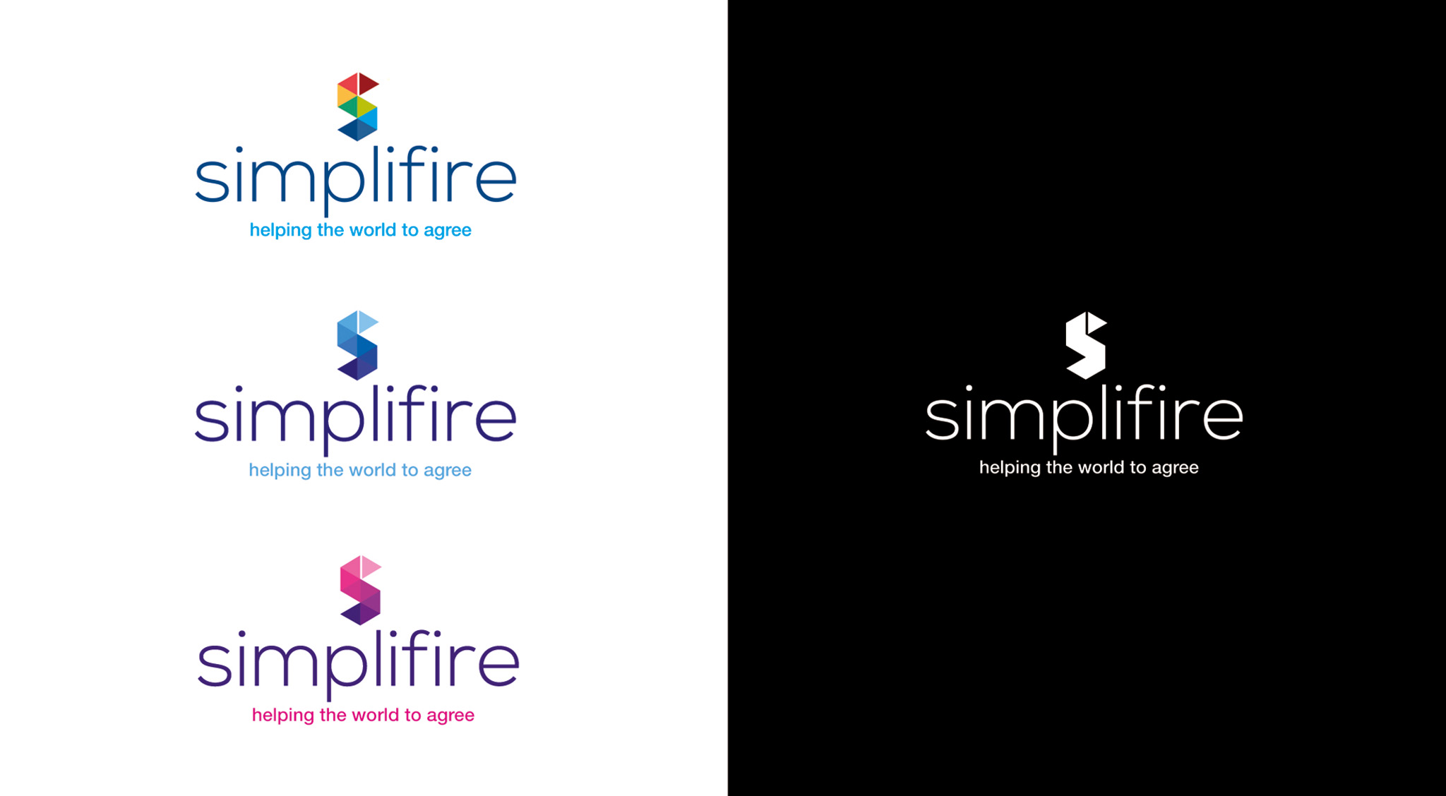
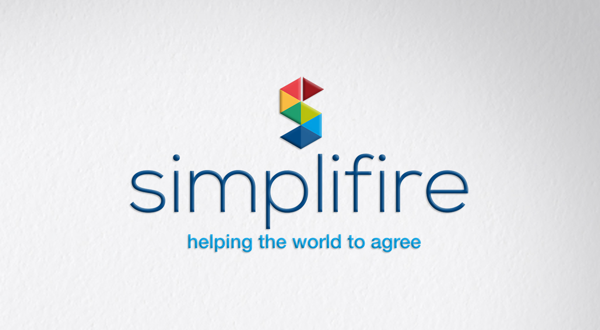
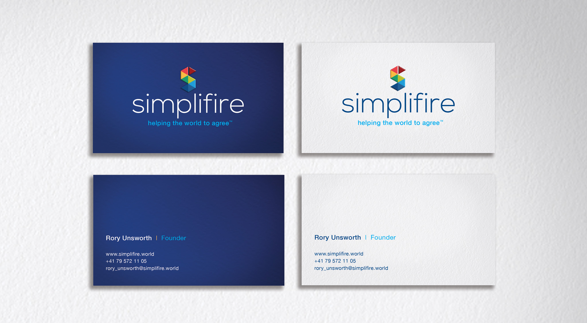
The brief was to create an identity that was strong and versatile. We took a good look at the competition to assess how the brand landscape matched up. We devised a wordmark that could be used as an entire device, as well as separately as a motif. The angular ‘S’ of Simplifire is divided into two elements.
The separate triangle acts as an arrow, symbolizing progression and forward movement. However the logo, when used in four colors, is made up of separate triangles, like folded paper. The branding works equally well with and without the tagline, and the ‘S’ symbol works effectively as an embossed detail by itself.
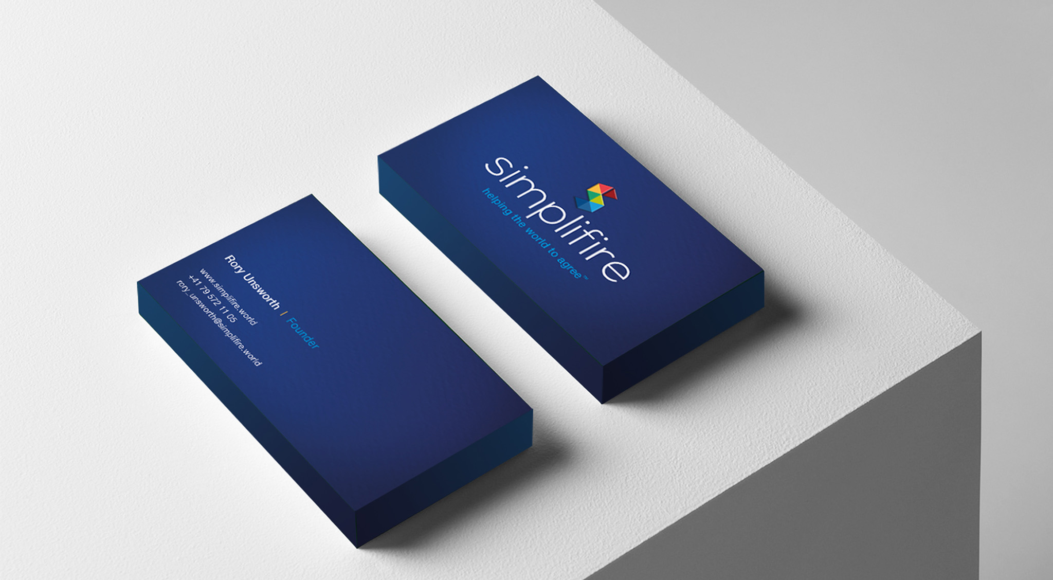
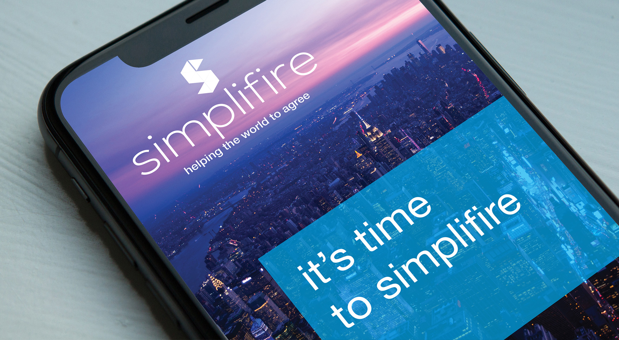
The visual identity was then applied across business cards and print marketing collateral, as well as a fully functioning web and responsive mobile platform.
Say it Smart!
Stand out for all the right reasons.
We help you communicate in a clear, creative and comprehensive manner. Make your message memorable…