You are moments away from your PERFECT Visual Identity
Whether you’re branding or re-branding your company, get ALL the tips and tricks all in one place.
What comes to mind when you look at the Coca-Cola logo?
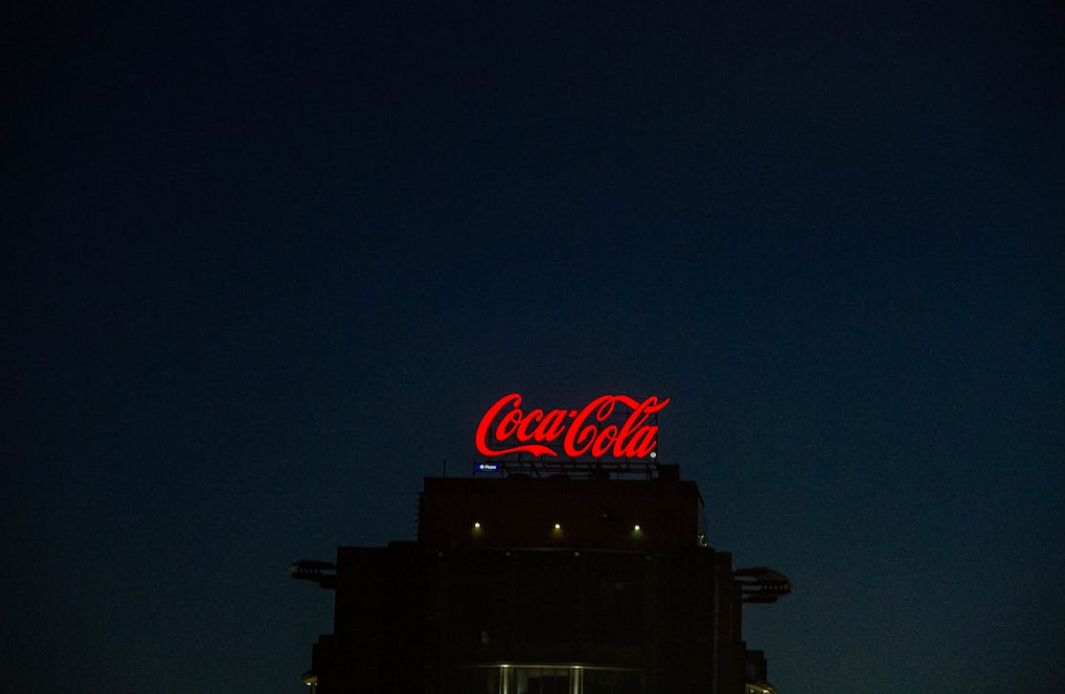
Maybe for some, it’s a nostalgic drink, bringing you back to summer days in the heat. For others, maybe it feels youthful and gives you a sense of boundless energy. Whatever it is, the coca-cola logo is heavily recognisable and omnipresent. A lot of coca-cola’s success is down to its logo, thus emphasising the importance of having a strong visual identity. In fact, as of 2021, it’s brand value is at 87.6 Billion US $. And you can bet a strong portion of that is down to its logo design. As a quality drink that has been around for almost two centuries, its visual identity is what has kept it in the markets. Its first impression was just as important.
First impressions are crucial, especially when you’re competing in cut-throat industries. On top of that, the internet and online businesses have meant that competitors have multiplied, which makes it more difficult for your business to really stand out. Princeton researchers have found that within 0.1 seconds, people form judgements about the likeability, trustworthiness, competence, attractiveness, and aggressiveness of faces in photos they were shown. Annie Crawford (2017) therefore questions, “what judgment will people form about your brand in the first 0.1 second of exposure?”
But you already knew that right? Well, at least the importance of great branding. The key here is understanding how to create a visual identity that supports your business identity and ideals.
Perfecting Visual Identity
1. Defining a ‘Visual Identity’
2. Differentiating Visual from Brand Identity
3. The Importance of Having a Visual Identity
4. Under the Umbrella of Visual Identity
5. Defining Your Brand
6. How to create a Visual Identity for Your Company
7. Qualitative Feedback
8. Sample Visual Identities
Defining a ‘Visual Identity’
On our own website, for Fullframe Creative, we have a page called ‘visual identity’, but what does it really mean? When it comes to identity, it’s everything that encompasses who you are; your aims and morals. So, that allows us to come to the conclusion that visual identity relates to presenting exactly who you are through visuals, whether that be a logo, images, videos, etc.
Aside from my own definition above, branding expert and marketing blogger, Goldstein (2021) has defined ‘visual identity’ as a “collection of visual elements that serve to represent and differentiate a brand. More specifically, it refers to any visible components such as a logo or brand that help customers identify a brand. By consolidating each branding asset into a cohesive aesthetic, this develops brand recognition.”

Visual vs. Brand Identity: Is there a Difference?
Lots of words have been thrown at you so far. Visual identity being a concept that has been repeated quite a bit too. So let me help you out there, and let’s define some concepts!
Pete Davis (2019) defines these two terms in the following ways:
Visual identity “can be viewed as a subset of your brand identity.”
A Brand’s identity “focuses on a wide variety of components including design, communications, products/services, and marketing.”
From my own understanding, a brand identity encompasses many aspects, whereas a visual identity points to design elements.
The Importance of Visual Identity
So what’s all the fuss about then? Why am I writing this article? The root cause is it’s meant to be beneficial to you and your company. Essentially, a visual identity is necessary when you want to build or maintain a strong brand as a company. I mention the word ‘maintain’ there, on purpose, as you may be trying to rebrand to keep loyal customers instead of starting from scratch.
Having a strong visual identity can create a sense of continuity within your company and branding. Continuity is difficult to maintain if you’re a company that constantly changes or is doing various projects all the time. In that case, a visual identity can help with that.
Kirsch (2022) points out a key importance of effective visual identities – she mentions that “visual identity can communicate a particular feeling or message without words. But a poorly-designed identity can confuse customers with lackluster messaging and disjointed graphics. So it’s no surprise that consistent brands are 3.5x more likely to have strong brand visibility than inconsistent brands.”
The key take-away from Kirsch here is the mention of possibility. Yes, visual identities can evoke specific notions. But, that’s only if they’re done successfully. So, just having a visual identity is not enough. In the meantime, if you’re thinking of needing help on customising your visual identity, consult our design & branding pages.
Under the Umbrella of Visual Identity

As we have already established, a visual identity involves everything related to a brand’s design. There’s a long list that you could get into, but I thought I’d include a few key ones that can help your company increase its brand awareness. These are the few that can come under your visual identity:
1) Icons.
2) Logo.
3) Color Palette.
4) Uniforms.
5) Billboards.
6) Digital and Print Ads.
Defining Your Brand
Before you do anything else, have a brainstorm of what makes you, you. You shouldn’t even be thinking about the above information if you haven’t defined yourself as a brand first. Therefore, ask yourself these following points before anything else:
1. Determine your goals. Have an understanding of what your personal branding aims to put forward in terms of messaging. It’s about who you are and what you want to be.
2. Pinpoint your unique value proposition. What is it that makes your company desirable? In other words, what solution do you offer to other people? What makes you different from others like you?
3. Craft your professional story arc. Stories are everything to everyone. Everyone loves a story and can remember one if told well. Therefore, don’t be afraid to have the company’s heritage; how have you started and what have you accomplished since.
4. Establish your company’s character personality. I’m maybe being a little repetitive here, but the point is, what often makes a company successful is that there is a unique personality present. Clients and customers see what makes it quirky and fun. Just like your service or product offers to fill a gap in the market, your company’s personality should shine through and stand strongly.
5. Distill it down to a brand statement. Here, you want one or two sentences showing your brand and company. Erskine (2016) has developed a great example to see the difference between an alright and great example of a brand statement.
The following examples present Santa’s brand:
A) “Santa Claus is the CEO of a non-profit organization that gives gifts to children globally. With decades of experience in supply chain management and manufacturing technology, Claus has helped turn Christmas into the modern celebration that it is today.”
This statement is a bit heavy, and provides nothing brand new. Instead, take a look at the example below:
B) “Santa Claus is the jolly, grandfatherly figure behind the single biggest gift-giving operation in the world. Known for his spectacular flying reindeer and wacky chimney delivery system, Claus has become a loved cultural icon who’s turned Christmas into the modern celebration that is today.”
Why does this statement stand out? Well, for one, more expressive adjectives are used to describe Santa. In addition, there’s stronger nouns employed to show the impact Santa has. For instance, the statement includes words like ‘cultural icon’ and ‘biggest gift-giving operation’. Unlike the other statement, a build-up of excitement could happen.

How to Create a Visual Identity for Your Company
Having determined key parts of what makes you a company; what makes you unique, you are ready to follow these FOUR key steps. These steps are essential to plan out before rushing to create your visual identity.

1) Create a logo. Something to keep in mind here is if you are creating a new logo from an existing company, that is that you are in the rebranding stages, you may want to maintain consistency. In other words, you still want your logo to imitate your values and style as a brand. You don’t want to change so much that you’re loyal and existing customers don’t know who you are.
2) Think about your color palette. You want to combine professionalism with uniqueness when it comes to thinking about your color palette. Maybe your color palette includes 1 main color; 2 primary colors; 3-5 complementary colors. Note here how simple it is kept. You want to be creative, but you don’t want to overwhelm viewers.
3) Choose your typography. Yes, font is a crucial part of your visual identity. It’s often suggested that your logo, all over your website and in all the documents created by your company that the typography should be consistent. Looking at all major brands, they all maintain uniformity.
4) Monitor your brand. This step is more of an after step in the process of creating a visual identity. In other words, you need to stay on top of what people think of you. This can be in the form of comments, social media discussions and surveys. You’ll be able to make changes to your visual identity, making sure you are keeping up with your competitors.
Receiving Qualitative Feedback on Your Visual Identity
Use feedback to develop brand experiences. You may be asking, “What is brand experience?” It’s all about the impression it leaves on your customers once they have interacted with your products, brand and services. The experience is all about the feedback you receive from customers; their reactions and thoughts. All of this data is useful towards the making of your brand and visual identity.
Beyond the data, it’s important to think about customers as humans. Humans experiencing your products. The more you are able to tailor brands and marketing strategies to the people behind your customers, the more everyone will be more personalized. And in the end, personalized features will alert your customers, increasing customer engagement with your brand.
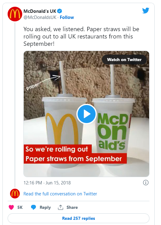
An example of feedback actually helping increase customer engagement is with McDonald’s in 2018, where they ditched plastic straws due to a customer-led petition with over half a million signatures. Customers’ loyalty and trust with McDonald’s only grew from there.
Sample Visual Identities
We’ve mentioned quite a few example brands in this article so far from Coca-Cola to McDonald’s. Coca-Cola is almost the ultimate visual identity to look up to. They’ve maintained they’re fun, youthful and playful side for almost two centuries now. However, there are other visual identities we want to turn your attention to. Take a look now:
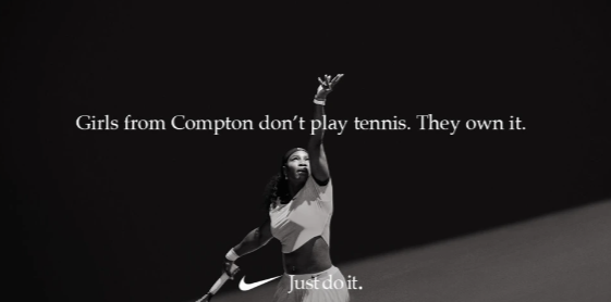
1) Nike’s empowering visual identity. The ‘Just do it’ slogan accompanied with its images makes an impact. It’s a direct call to action with every advert and logo. Key to Nike’s branding strategies is that they evoke feelings and emotions rather than directly advertising their products.
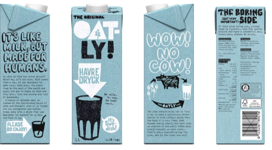
2) Oatly’s striking visuals. Dairy alternatives are growing more popular by the day. The bord font and quirky illustrations, with thick lines, represent the company’s daring ambitions. The majority of food and beverage companies make their fonts clear, which is understandable as the function of being able to read the information is important. However, Oatly stands out with their decision to go with a more fun font. The convention breaking here aligns with their brand’s mission to change mindsets and innovate the non-dairy industry.

3) Netflix and its Bold Red. The visual identity is simple yet outstanding. It’s powerful and catches the attention of anyone wherever it is. It’s almost like they own the color red in terms of branding. The color palette of the red and black evokes a sense of power and control, aligning with their ‘unlimited movies and TV shows’ and their dominance within their market and industry.
Final Thoughts: Your Perfect Visual Identity
Finally, we hope we’ve ingrained, like a bad tattoo, the idea that a visual identity is essential for a brand to really take-off, whether it’s for branding or rebranding purposes. We have outlined several ways to approach your visual identity and shown you plenty of examples. It’s now your turn to continue what you were doing before reading this blog post; creating the next Coca-Cola; a timeless classic.
If you do feel that you need some guidance, Fullframe Creative provides a cutting-edge creative communication service: original concepts; clear, creative and concise content delivered competently. In other words, we help you get your message across through the following tools and services:
- Video Production & Animation – corporate video, social media video, drone, interviews, interactive, video marketing, explainer videos, infographics, motion graphics and lots more.
- Design & Branding – digital concept development & strategy, web & interactive design, visual identity, graphic design.
- Digital & Social Media Marketing – campaign strategy, design & management, copy & content writing, blogs & SEO.
- Virtual-hybrid Events & Tours / Video-conferencing – webinars, full event development & management, moderation & hosting, virtual visits.
- Media Training – public speaking & coaching, look & sound great on camera.
- Green-screen Production Studio – large video & photo production studio, 100% soundproof, professionally equipped 360o green-screen.
Fullframe has 10+ years of experience, 100+ satisfied customers and 1,000+ successful productions. We work in and around the Geneva and Lausanne area, but serve companies across Switzerland and abroad too.
We help you Spark up your Image!. Let’s talk.
Spark up your Image!
Stand out for all the right reasons.
We help you communicate in a clear, creative and comprehensive manner.